After the interesting relationships I found between stats for guards in my previous post, I wanted to gain more insights about forwards in the NBA. I specifically looked at all forwards who averaged at least 20 minutes per game during the 2013 regular season, a sample size of 58 players.
Scratching the Surface
In order to make sense of the noisy relationships between key player stats, I once again looked at correlations. A few things jumped out at me:
1. Points provide a relatively strong signal for contribution.
Points have a fairly strong correlation with plus/minus scores (+0.46) versus just +0.08 for guards. Based on the sample of forwards and guards used in this analysis, guards score 14.3 points per game, on average, versus 13.2 from forwards. Thus, on average, forwards do not score more than guards even though their plus/minus scores are more highly correlated with points. Interestingly, the average plus/minus score for guards is +0.91 versus +1.58 for forwards. Here is a player profile providing some insights between the relationship of plus/minus scores and points for forwards:

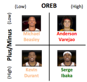
2. Offensive and defensive rebounds imply opposite signals.
Offensive rebounds have a slight negative correlation with plus/minus scores (-0.17) while defensive rebounds have a slight positive correlation with them (+0.16). At first, it was not clear to me why this would be the case, since offensive rebounds generally provide second-chance points to teams who secure them. Then, I noticed two interesting relationships.
The first is that fouls and offensive rebounds are highly correlated (+0.51). One potential explanation could very well be that players who grab a lot of offensive boards tend to be very physical players who would be more likely to be called for fouls. The second is that offensive rebounds have a much weaker correlation with games started than defensive rebounds do (+0.20 versus +0.56). This implies that those who start fewer games tend to have more offensive rebounds than they do defensive ones. Here are two player profiles providing some insights between the relationship of plus/minus scores and rebounds for forwards:

3. Shooting efficiency and free-throw accuracy are inversely related.
Free-throw percentage and field goal percentage had a fairly strong negative correlation (-0.40). This is a surprisingly intuitive relationship—forwards are generally much larger than guards and tend to shoot closer to the hoop, on average. These shots are generally high percentage shots. As a result, some forwards who are not great long distance shooters (like Blake Griffin) are able to maintain a high field goal percentage with a very subpar free-throw percentage.
Digging Deeper
Given all of these correlations in such a high-dimensional space (I was examining 21 factors), it was very difficult to develop an objective understanding of overall player value. In order to better visualize these players and their strengths and weaknesses, I needed to boil these 21 features down to a significantly smaller set that was easier to keep track of. From this simplification, I wanted to show that many of the key player stats could be bucketed together into key feature sets that might not necessarily be intuitive at first glance. This could potentially be used to help provide a more holistic sense of player contribution. In order to perform this analysis, I used the principal components analysis (PCA) technique. For an optional, more detailed mathematical explanation, please click here.
The first significant dimension was heavily weighted by: defensive rebounds, average minutes, turnovers, points, and assists. Based on this feature set, I would describe this dimension as “High Volume.” The second dimension was heavily weighted by: offensive rebounds, career field goal percentage, fouls, free-throw percentage, and season field goal percentage. Based on this feature set, I would describe this dimension as “Strong Shooting.”
With these two dimensions in mind, I transformed each player into a single point in this new coordinate system. To provide some context for each point, I labeled each player as “All-Star” (was in the 2013 All-Star game), “Playoffs” (was in the 2013 playoffs but was not a 2013 All-Star), or Regular (for the remaining players):
")
In the graph above (please click to enlarge), I visually created three main player groups to focus on:
1. The golden circle in the upper right captured, arguably, the two best forwards in the game today, Kevin Durant and LeBron James. These superstars are high along both dimensions, indicating that they are both strong shooters and high volume players.
2. The blue circle managed to capture all of the 2013 All-Stars with the exception of Tim Duncan, who is more “high volume” than some of the other All-Stars due to his particularly strong defensive rebounding. Interestingly enough, the “Regular” players who were included in this circle (Rudy Gay, Nicolas Batum, and Paul Millsap) are pretty solid players who happened to be on bad teams last season that did not qualify for the playoffs.
3. The orange circle captured a large concentration of “Playoffs” players, but there are many that still remain spread out over the coordinate axis. It makes sense that this group of players is noisy since the label is a relatively loose one to begin with. A player’s presence in the playoffs has a lot to do with his environment (i.e., the players around him and the team he is on), so it does not necessarily isolate individual contribution.
It is important to note that, though a vast majority of the “good players” (players who made an appearance in the 2013 playoffs even if they were not All-Stars) were high along the second dimension, the “great players” (All-Stars) were also high along the first dimension. This implies that “good players” tend to be fairly efficient players who may not get the most minutes while “great players” tend to have great stat lines with their extended minutes while maintaining a strong level of efficiency.
Based on the interpretability of the “Players Factor Map” above, it seems to have done a fairly good job of separating the signal from the noise for all of the correlated and potentially redundant features explored in this analysis. It was particularly useful to not be tied down by a single metric as a value function (for instance, plus/minus scores). Although I did name the two dimensions in a way to make them more descriptive and relatable, the features were bunched in ways that were not immediately intuitive to me. For instance, offensive and defensive rebounds are strong weights along different dimensions, despite their high correlation of +0.58. However, looking back at the original correlations, offensive rebounds had a relatively strong positive relationship with field goal percentage (+0.42). As a result, the reduced dimensionality seems to match up with the key correlations that may not necessarily be intuitive. This simplification seems to be fairly good at providing a strong high level signal of player value!
Stay tuned for my analysis on Centers…


It is interesting that points are important for forwards but they aren’t for guards… Cool descriptive analysis with the PCA–I wish I knew more stats.
“Interestingly enough, the “Regular” players who were included in this circle (Rudy Gay, Nicolas Batum, and Paul Millsap) are pretty solid players who happened to be on bad teams last season…”
I like being able to pick out the diamond players in the rough, and I’m sure teams looking for trading up would like useful stats like this.
It’s interesting to see when statistical analysis matches up with what an average fan can discern (Lebron and KD being a cut above) and when it doesn’t. I’d be interested in seeing whether these dimensions contain factors weighted similarly for the other positions.
The correlations between rebounds and +/- really surprised me. Thanks for posting!